
Designing a responsive UI in Flutter while considering different screen sizes is essential for a consistent user experience across devices. In today's digital world, users access apps from a wide range of devices—smartphones, tablets, and even desktops. That’s why building a responsive user interface (UI) in Flutter is not just nice to have—it’s essential. Whether you're developing for a low-end phone or a high-resolution tablet, ensuring your UI adapts beautifully is key to a great user experience.
WHAT IS A RESPONSIVE UI IN FLUTTER?
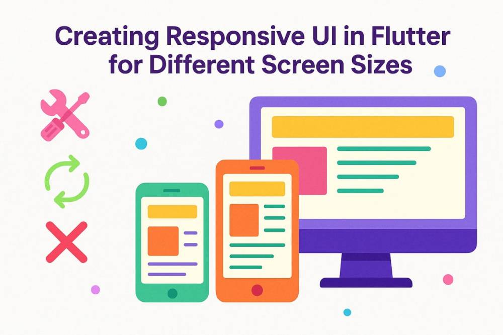
A responsive UI adapts seamlessly to various screen sizes, resolutions, and orientations. It ensures that no matter the device, your app looks clean, is easy to navigate, and delivers a consistent experexperience.
WHY IT MATTERS
■ It enhances usability across devices.
■ It increases user satisfaction.
■ It makes your app look professional and scalable.
BEST PRACTICES FOR CREATING RESPONSIVE UIs IN FlUTTER
1. Know Your Screen Space
Flutter offers tools like MediaQuery and LayoutBuilder to get screen size and layout constraints. These help tailor your UI to different devices.
2. Think in Flex
Using widgets like Flexible and Expanded allows your UI elements to adjust and share space efficiently, rather than having fixed sizes that break on larger or smaller screens.
3. Embrace Adaptive Layouts
Tools like Wrap, FittedBox, and AspectRatio are perfect for flexible arrangements and scalable elements, especially for dynamic content.
4. Utilize Responsive Design Packages
Packages like flutter_screenutil or responsive_framework simplify scaling fonts, widths, and heights proportionally across devices.
5. Avoid Hardcoded Dimensions
Instead of setting a fixed width or height, let the layout respond to available space. Think in percentages or proportional sizing instead.
6. Plan for Orientation Changes
Design layouts that can handle both portrait and landscape modes. OrientationBuilder can help detect and adjust accordingly.
HERE ARE SOME SIMPLE CODING GUIDES WITH BEST PRACTICES
1. Use LayoutBuilder and MediaQuery
These tools help you detect screen constraints and adapt accordingly.
LayoutBuilder(
  builder: (context, constraints) {
    if (constraints.maxWidth > 600) {
      return _buildTabletLayout();
    } else {
      return _buildMobileLayout();
    }
  },
)
You can also use:
double screenWidth = MediaQuery.of(context).size.width;
2. Flexible & Expanded Widgets
These widgets help distribute space proportionally in rows and columns.
Row(
  children: [
    Expanded(child: Text("Left")),
    Expanded(child: Text("Right")),
  ],
)
3. Use FittedBox, Wrap, and AspectRatio
FittedBox: Scales its child to fit.Wrap: Automatically wraps items to the next line.AspectRatio: Maintains a certain width/height ratio.
4. Responsive Packages
- flutter_screenutil: Helps with screen size scaling.
dependencies:
  flutter_screenutil: ^5.5.4
ScreenUtilInit(
  designSize: Size(360, 690),
  builder: () => MaterialApp(
    home: MyHomePage(),
  ),
)
Use ScreenUtil().setHeight(), ScreenUtil().setWidth(), etc.
5. MediaQuery for Padding and Orientation
var padding = MediaQuery.of(context).padding;
var orientation = MediaQuery.of(context).orientation;
6. Avoid Fixed Sizes
Instead of:
Container(width: 300)
Use:
Container(width: MediaQuery.of(context).size.width * 0.8)
7. Use LayoutBuilder or OrientationBuilder for Breakpoints
To show different UIs depending on screen size or orientation.
Conclusion
A responsive UI in Flutter is your ticket to building apps that feel at home on any screen. By focusing on flexibility, scalability, and good layout practices, you’re not just coding—you’re crafting user experiences that last.
ʀᴇᴍᴇᴍʙᴇʀ we ᴅᴇᴠᴇʟᴏᴘ Qᴜᴀʟɪᴛʏ, fast, and reliable websites and ᴀᴘᴘʟɪᴄᴀᴛɪᴏɴꜱ. Reach out to us for your Web and Technical services at:
☎️ +234 813 164 9219
Or...
🤳 wa.me/2347031382795